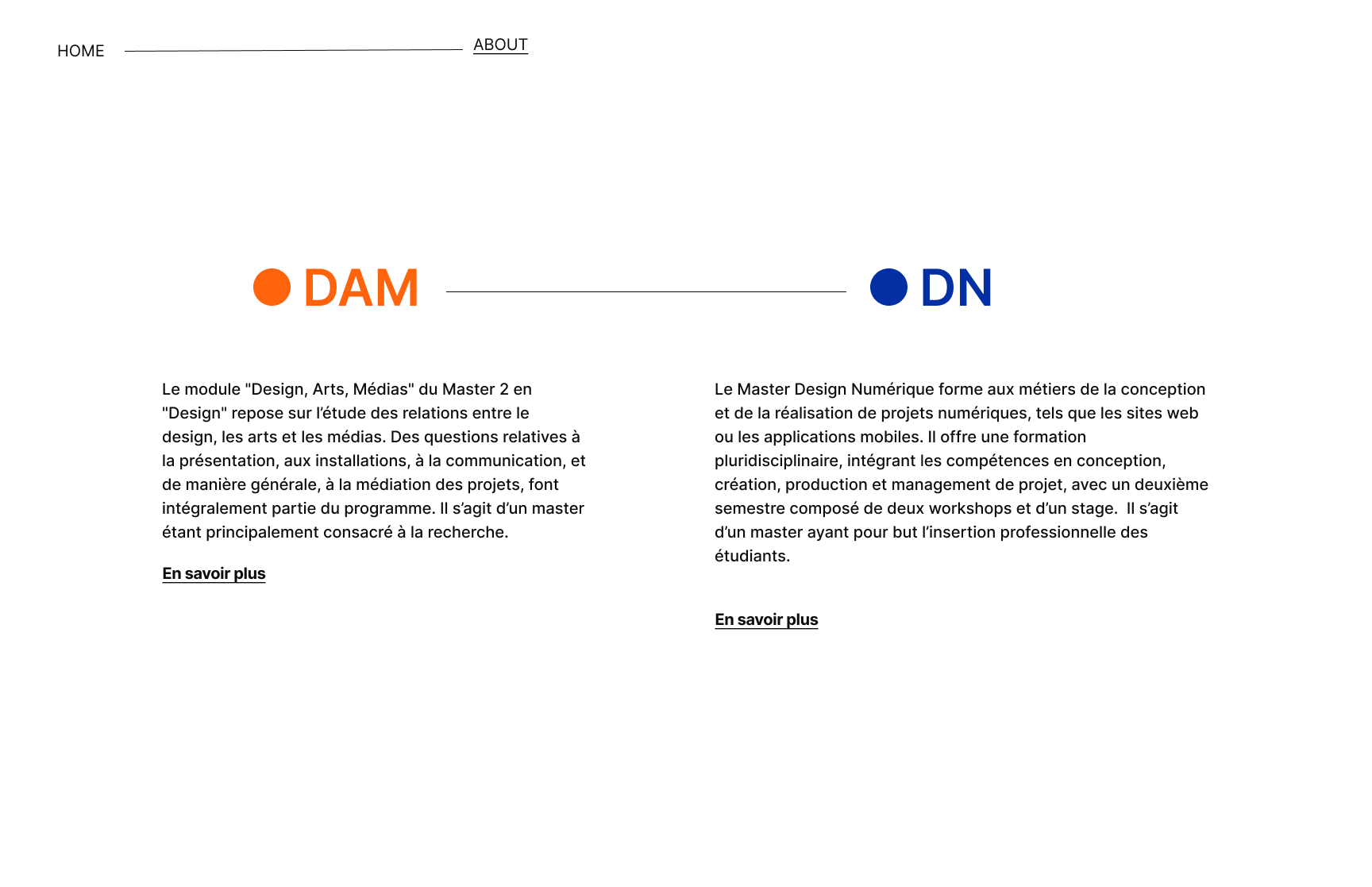
This webpage design presents an overview of two master's programs in design: DAM (Design, Arts, Médias) and DN (Design Numérique). The layout emphasizes the visual and textual contrast between the two programs, using color-coded circles (orange for DAM and blue for DN) as visual markers for differentiation.
As a UI/UX designer in a collaborative team, my contributions to this project included:
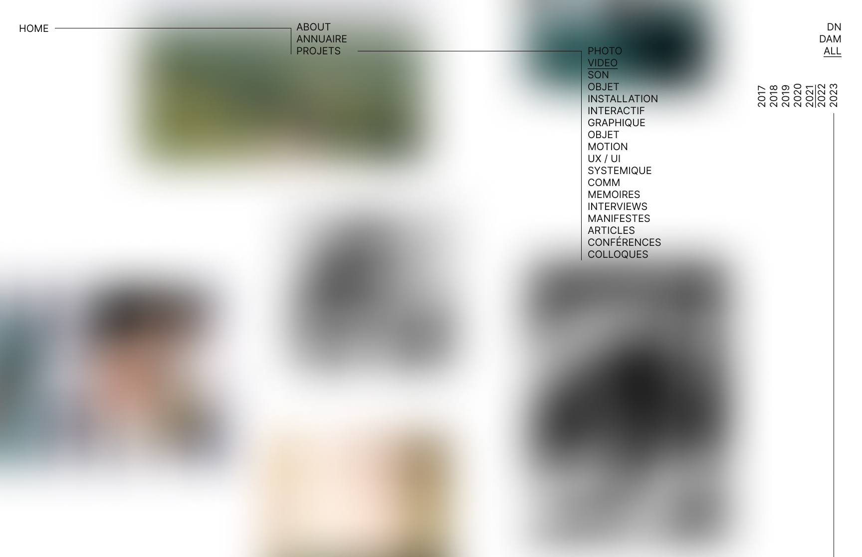
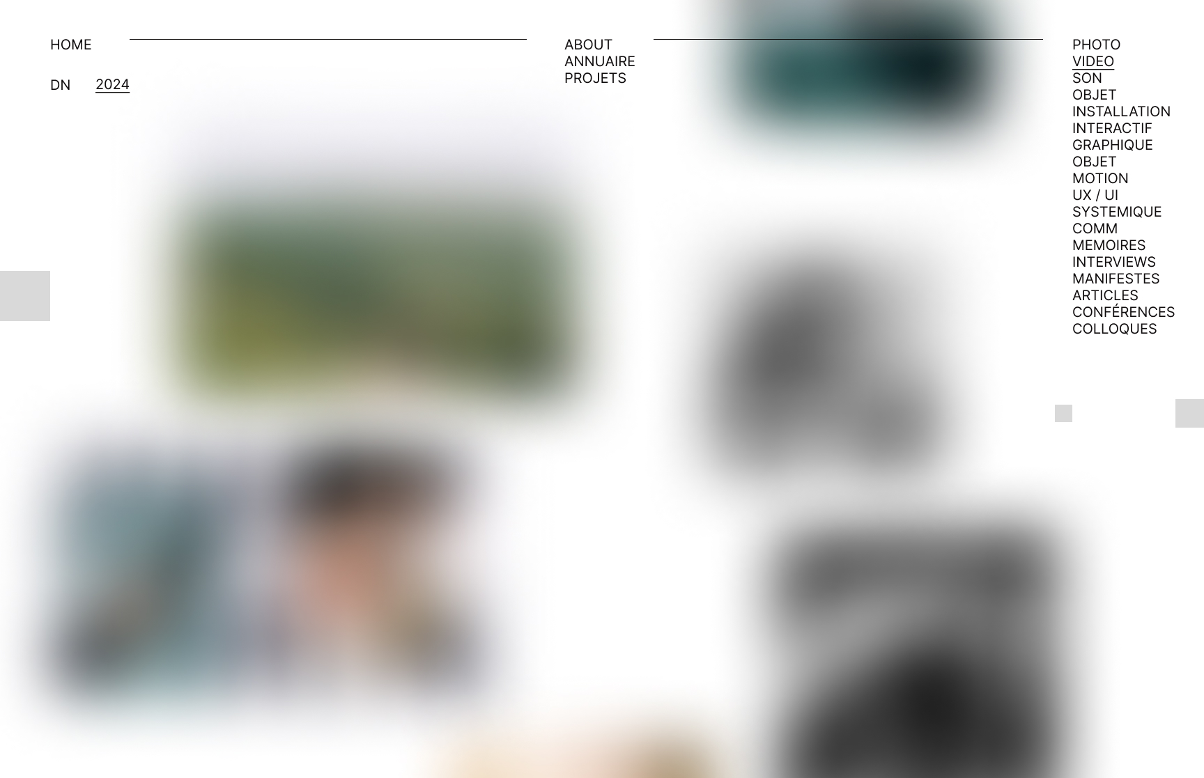
Wireframing and Prototyping: Creating the initial layout structure to ensure visual balance and clarity between the two programs.
User Flow Optimization: Simplifying navigation through minimalistic design and clear calls-to-action, improving user engagement.
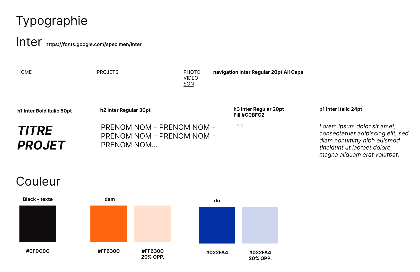
Color and Typography Choices: Designing with distinct color schemes to differentiate the two sections, ensuring accessibility and readability.`